NEON SIGNAGE

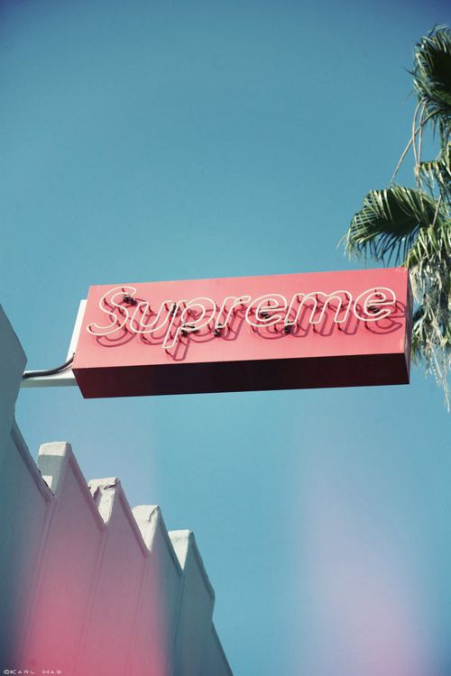
Signage is impactful- as usually the first thing a guest or passerby sees, signage can entice, dispel, awaken and define. What a better way to do this, than with neon?

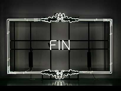
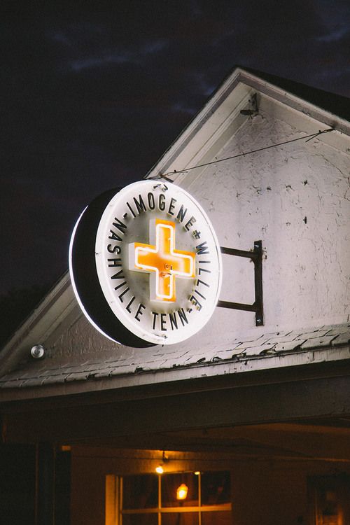
Neon signage, with it characteristic reddish-orange glow, awakens fond memories of 1950's diners and bowling alleys. And that's exactly why it is still being used today- it is memorable. The ability to write and demonstrate in glowing, bright colors is quite attractive to any brand, contemporary or midcentury. Any other colors besides the reddish-orange, is actually a different type of inert gas or element, creating a whole spectrum of colors depending on gaseous mixtures and electric current.

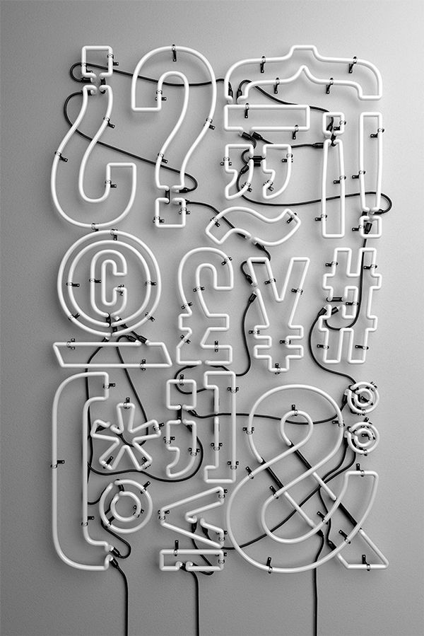
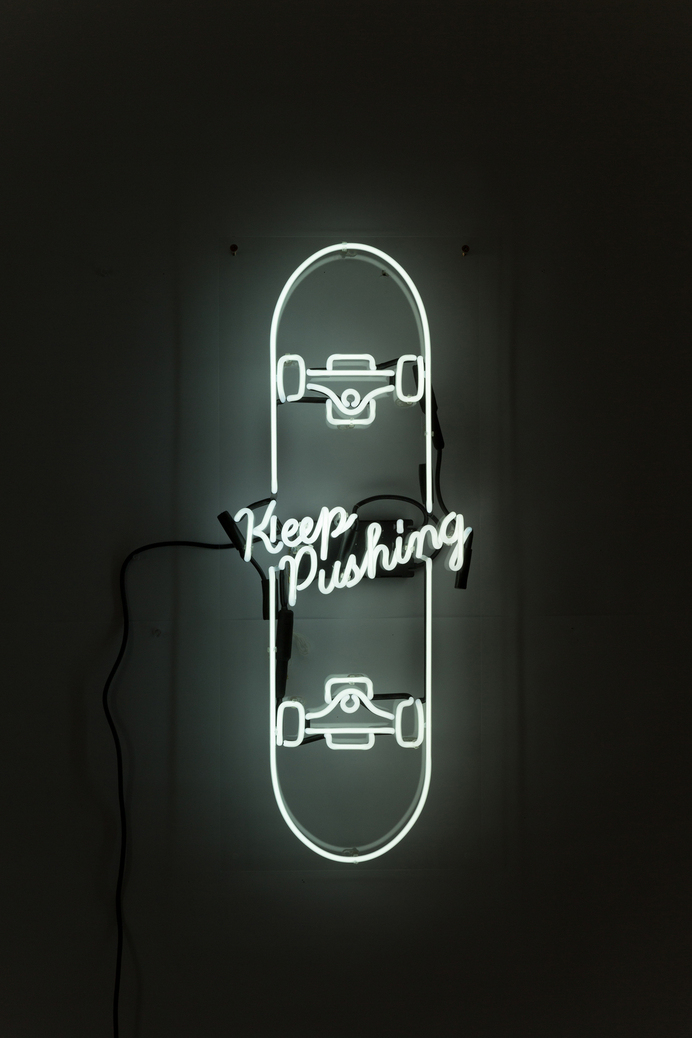
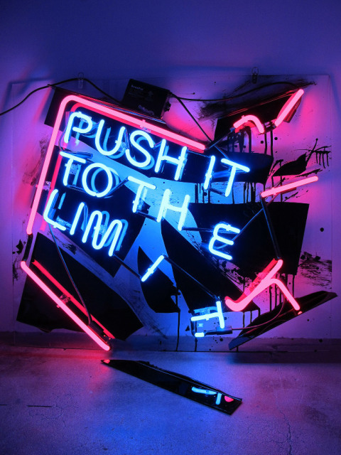
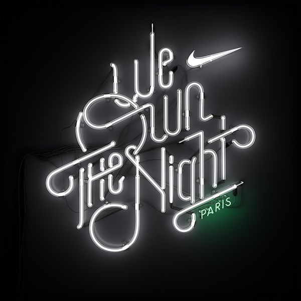
We see it today in lots of applications: brand names and logos, unconventional text and phrases, a back-lit glowing effect and often encased in metal lettering to resemble vintage marquee lettering. A new trend taking the neon scene, is typography created from custom bent glass tubes filled with a gas. See the Nike sign below- a demonstration of typography at its finest, conveying brand values through a specific campaign.

RECREATE: explore different branding techniques using neon signage, especially custom typography and shapes. Or scout some antique malls and incorporate vintage signage into a bar scene for a nostalgic vibe.
SLATTED WOOD

Wood is a complex, diverse material, with soft and hard options, with a variety of colors and grains. Subtle changes in color and directionality can create complex textures, opportunities for signage, and ever-changing screen partitions.
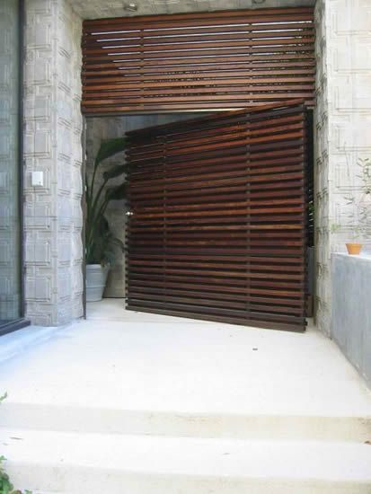
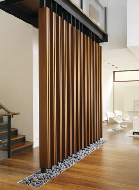
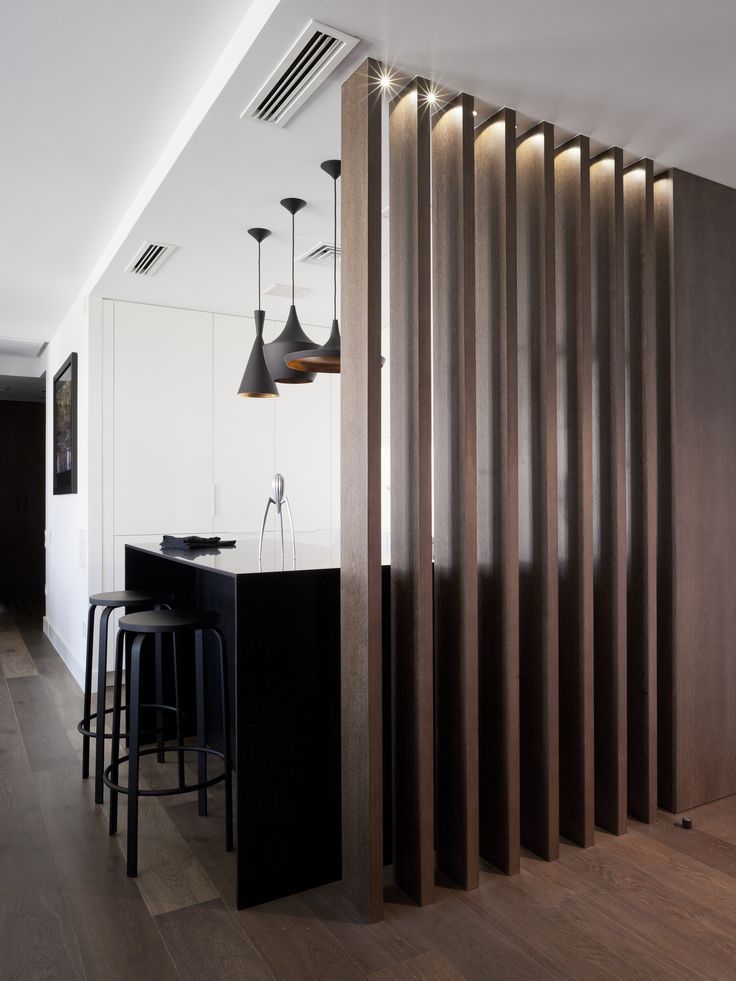
Slatted wood is repetitive thin wood widths, arranged in a consecutive pattern, either in a vertical/horizontal flat plane, or in geometric shapes. Slats allow partition walls and doors to be semi-transparent, letting in light and eye sight when positioned in a parallel form, but enables changing shadows and views with horizontal and vertical movement.

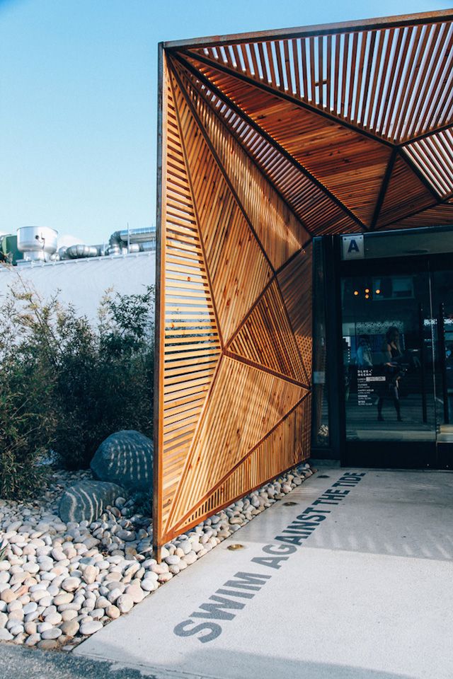
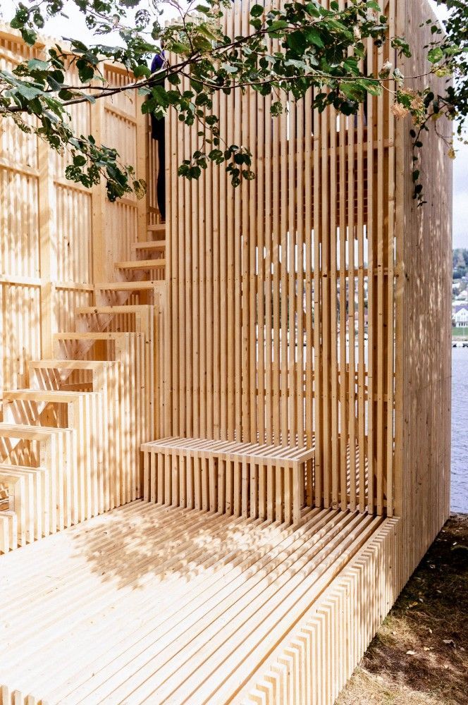
Wood slats are being used in all forms and on all planes of interior design: ceilings, floors, walls, millwork, and even furniture has all incorporated slatted wood for the better. Below, we see many forms of slatted wood in dynamic spaces:

  • millwork and entry details are an intriguing addition, pulling consumers into the space, and continuing eye movement
  • an architectural screen or window wall, allowing filtered light into the interior spaces that change depending on sun height and location
  • subtle signage that peek through the slats in differentiating wood color and texture
  • overlapping patterns of wood strips create an extra layer of pattern and geometry
  • wood slats on the ceiling to hide ugly HVAC systems and air vents, but still allowing maximum air flow
  • CNC-ed wood strips to create a continuous bench and wall

MODERN TROMP L'OEIL

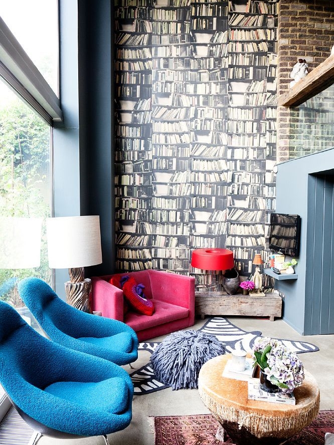
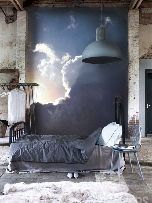
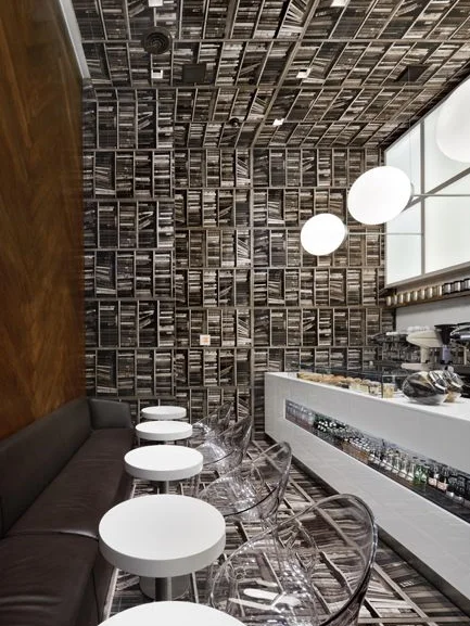
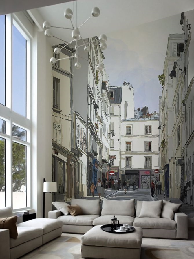
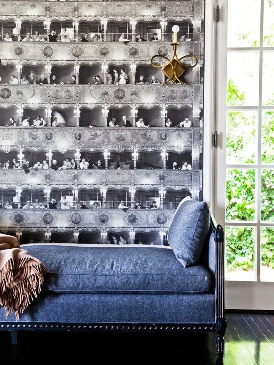
Tromp L'Oeil, or to deceive the eye, is an art technique that originated in the Baroque period, utilizing perspective sketching and drawing to create realistic paintings and artwork. Deception of depth and materials, especially seen in set design, builds new and unexpected spaces with just a paintbrush.

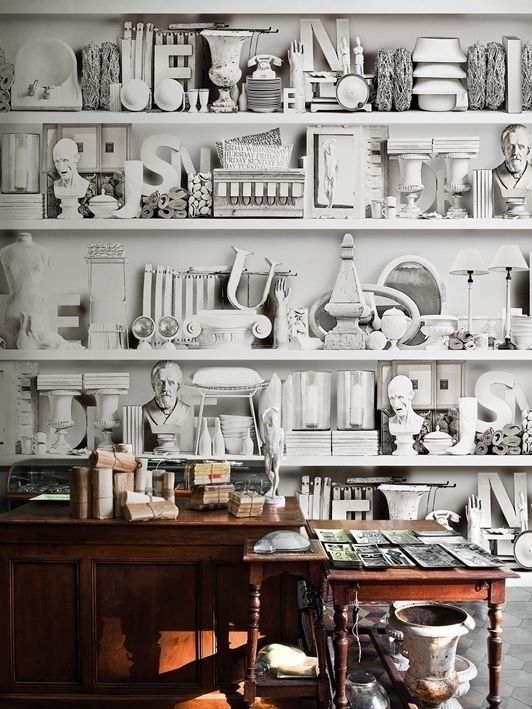
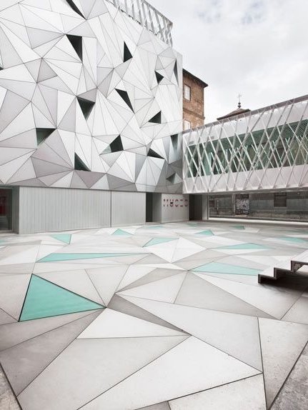
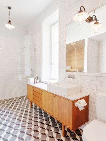
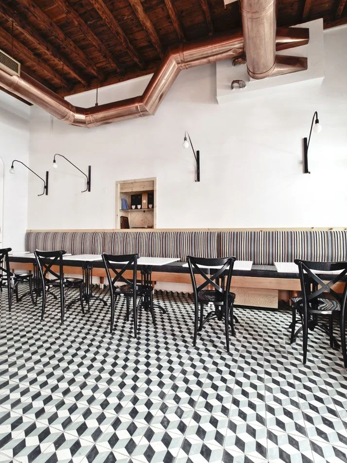
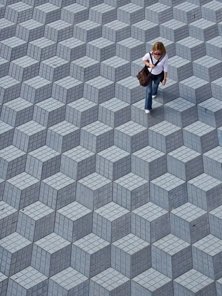
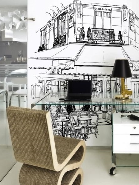
We're now seeing modern, unique wallcoverings with tromp l'oeil patterns, creating either realistic perspectives or miniature dioramas. Mostly monochromatic, tromp l'oeil wallcoverings provide an unnatural feeling of space and horizon with bookshelves turned on their sides and white props stacked on imaginary shelves. Found in cafes, lounges, and waiting areas, these graphic walls invoke interest through traditional artistic methods. Floors have also taken on a tromp l'oeil effect, mostly through tiling techniques. We see geometry creating faux three-dimensional planes through shadow and highlight tiles. See below for our favorites.

RECREATE: use with a neutral backdrop, to avoid too much visual stimulation. Click on images for original source.